It’s been a minute, hasn’t it? No, we haven’t ghosted you—we’ve just been freaking busy (the good kind). The kind where new work rolls in, great clients keep coming back, and our team doubles down to make sure we’re delivering the kind of service that makes you think, Oh right, THIS is why we hired Crackerjack.
One thing we’ve been especially fired up about lately is websites (more specifically, homepages). The kind that work hard for you—not against you. Smart-but-simple design. UX that doesn’t make you second-guess yourself. Pages that look just as good on your phone as they do on that giant monitor you swore you needed. Clarity over chaos. Purpose over pretty-for-pretty’s-sake.
Because the best homepages aren’t flashy. They’re thoughtful. Simple, but not boring. Helpful without being heavy-handed. They guide, clarify, and quietly build trust—on every screen, for every visitor.
So, we put together a quick guide on what not to do…and how to get it right. More below.
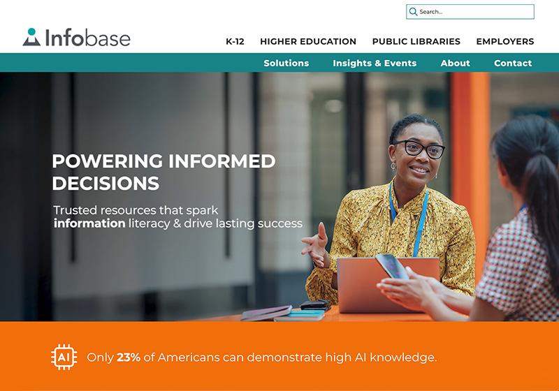
7 Homepage Red Flags 🚩and How to Fix Them
A great homepage guides visitors, answers their questions, and keeps them curious. If yours isn’t doing that (yet), these tips will help you get there.
Buried value prop
- Why it’s bad: If your visitors can’t tell exactly what you do (and what’s in it for them) in a few seconds, don’t expect them to stick around.
- Make it better: Lead with who you are and what makes you different, captured in a short, memorable statement. Then, dive into the how and the why: “How does it work?” and “Why should I trust you?”
Goal overload
- Why it’s bad: When you ask visitors to register for a webinar, download a white paper, and schedule a call in the same place, you’re not giving them options—you’re giving them decision fatigue.
- Make it better: Use the breadcrumb technique to lead readers down one clear path: start with a primary CTA in the hero section, then use secondary CTAs for other important actions, like downloading a case study or exploring a specific service.
Death by design
- Why it’s bad: Busy visuals create confusion, slow down your site, and take away from the information your visitors actually need. And if your page isn’t mobile-friendly, you’ve already lost half your audience.
- Make it better: Choose clarity over flashiness. Make important pieces easy to spot, and ensure your page is served up perfectly on every device and screen.
Stale content syndrome
- Why it’s bad: A homepage with dusty stats from 2005, pandemic-era blog posts, excessive stock images, and broken links could make your visitors second-guess your credibility.
- Make it better: Update content regularly, include timely announcements, and skip the brochureware approach. Long story short, if you don’t have time to keep the content up to date, get rid of the element altogether.
No SEO (or GEO) in sight
- Why it’s bad: Your site may look great, but if search engines and AI can’t figure out what you do, your intended audience might never see it.
- Make it better: Answer the questions your visitors are already Googling or plugging into ChatGPT with authentic, keyword-packed headlines and content.
It’s just not accessible
- Why it’s bad: Tiny or low-contrast text, missing alt text, unlabeled buttons, and designs that can’t be navigated by keyboard or screen reader shut people out—and tank the user experience for everyone.
- Make it better: Follow ADA basics—clear text, proper contrast, and accessible controls—so every user can get to know your company without hitting roadblocks.
Navigation with no destination
- Why it’s bad: A confusing menu, clunky UX, and pages three clicks deep may leave your visitors scrambling for answers—or looking for them elsewhere.
- Make it better: People arrive to a site with a purpose, so don’t make them dig for it. Use intuitive labels, smart groupings, and, if you’re loaded with content, a mega menu that lets them scan everything fast.
Case Studies

Infobase
As a leading provider of information literacy solutions, Infobase needed a site that worked as hard as their (many) products do. That’s why we reimagined their webpage UX for a faster, more intuitive experience—highlighting what they do up front, simplifying their navigation, adding search features, and crafting polished journeys for their key audiences.
The main attraction: A dynamic mega menu designed to make their extensive content a breeze to navigate.

Income America
For guaranteed retirement income solutions provider Income America, we designed, wrote, and built their website to serve three audiences—financial professionals, plan sponsors, and participants—making it easy for them to find what they’re looking for with clear, hard-to-miss CTAs.
The main attraction: Personalized journeys that lead each audience down the right path.
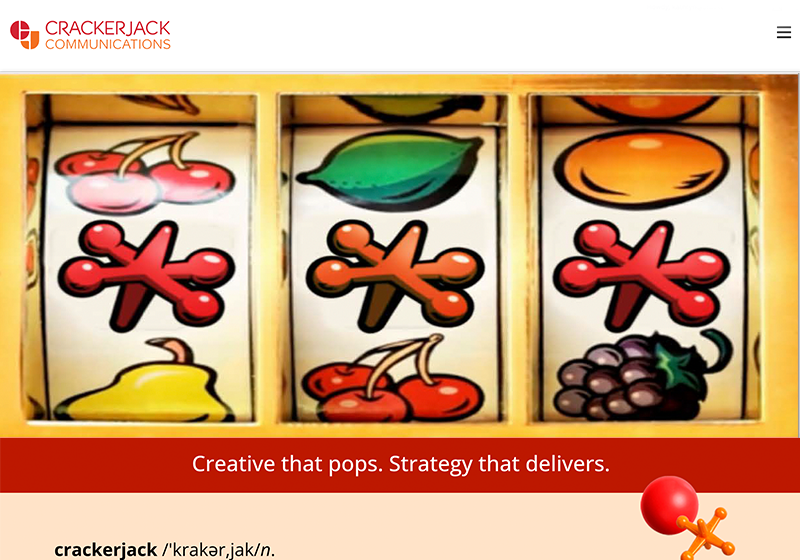
Crackerjack
She’s beauty. She’s grace. She’s got a damn good interface. Our new website is fun, fresh, and full of the Crackerjack energy we bring to every project—complete with smart sort functions, eye-catching design elements, and more.
The main attraction: A bold, snappy feature video showcasing the breadth of our work.
Oh, Snap!
